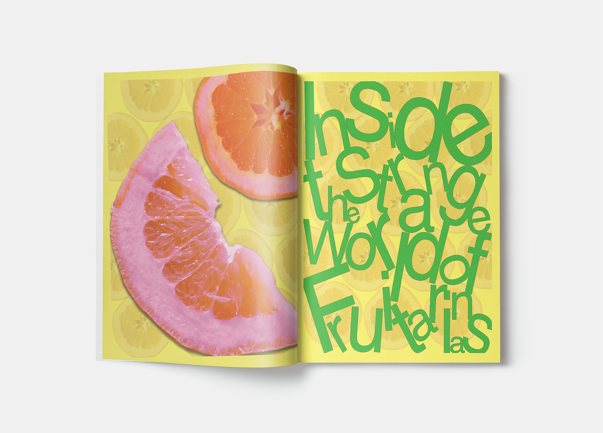
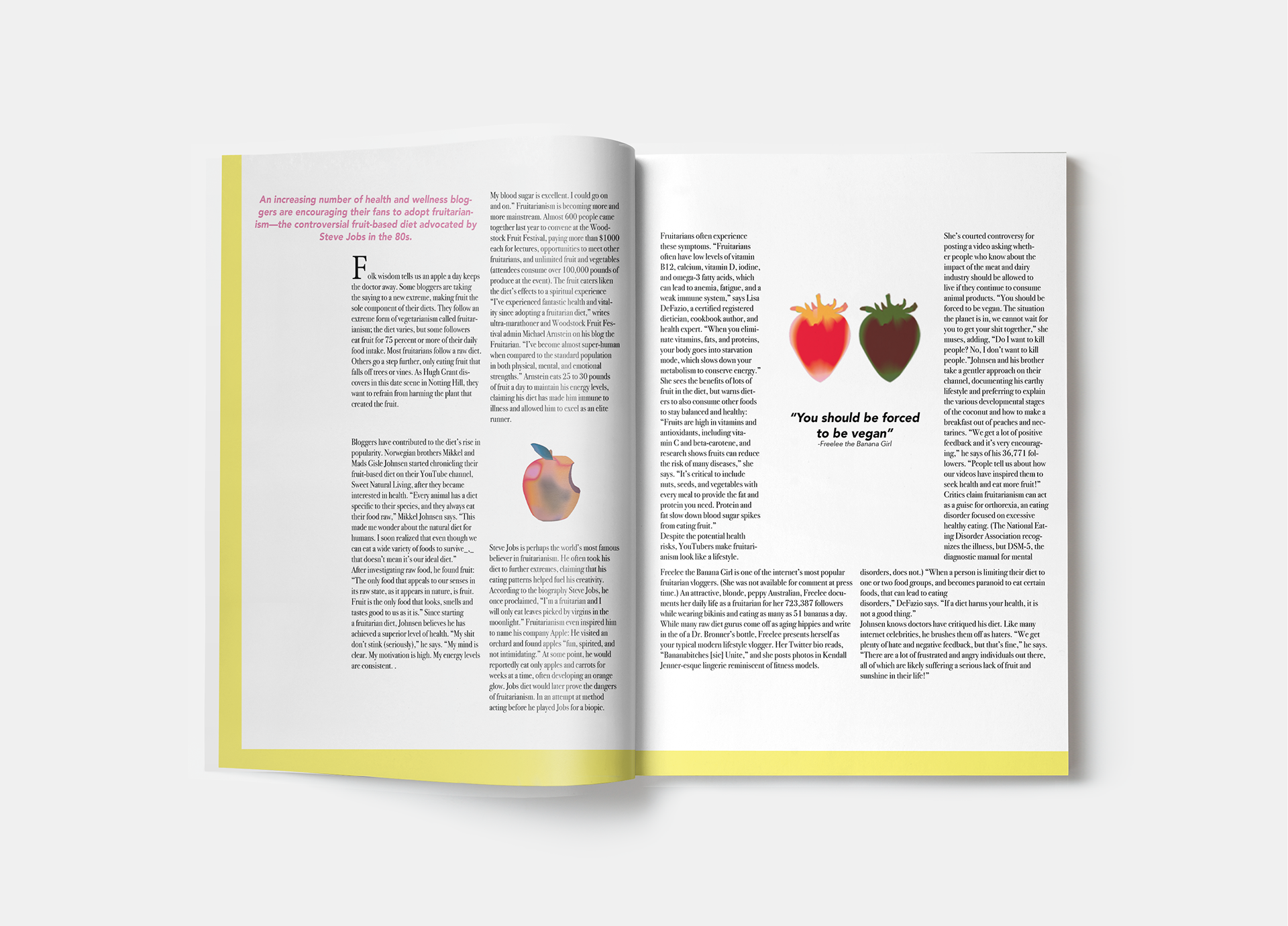
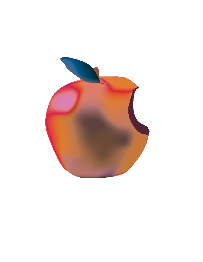
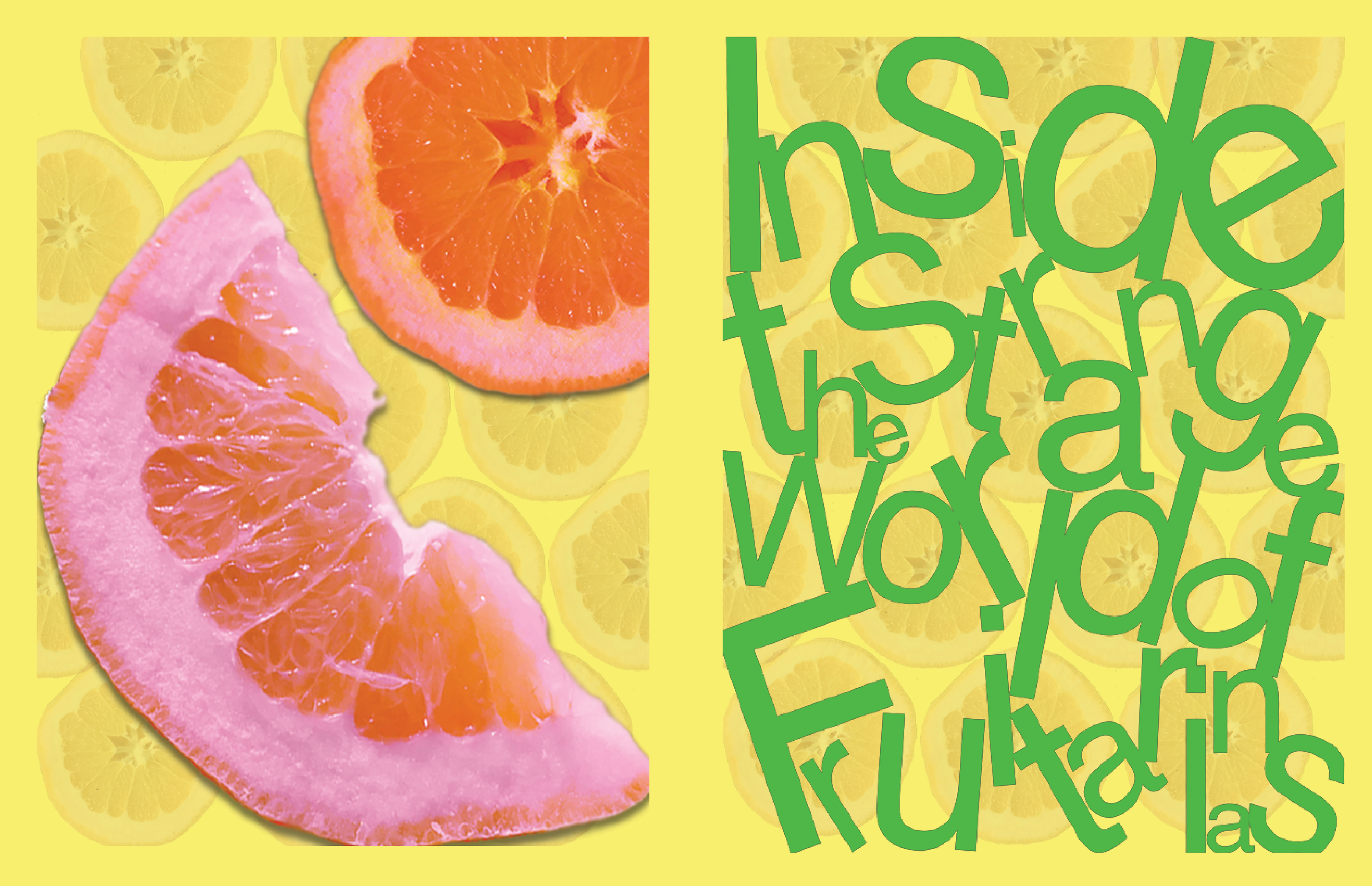
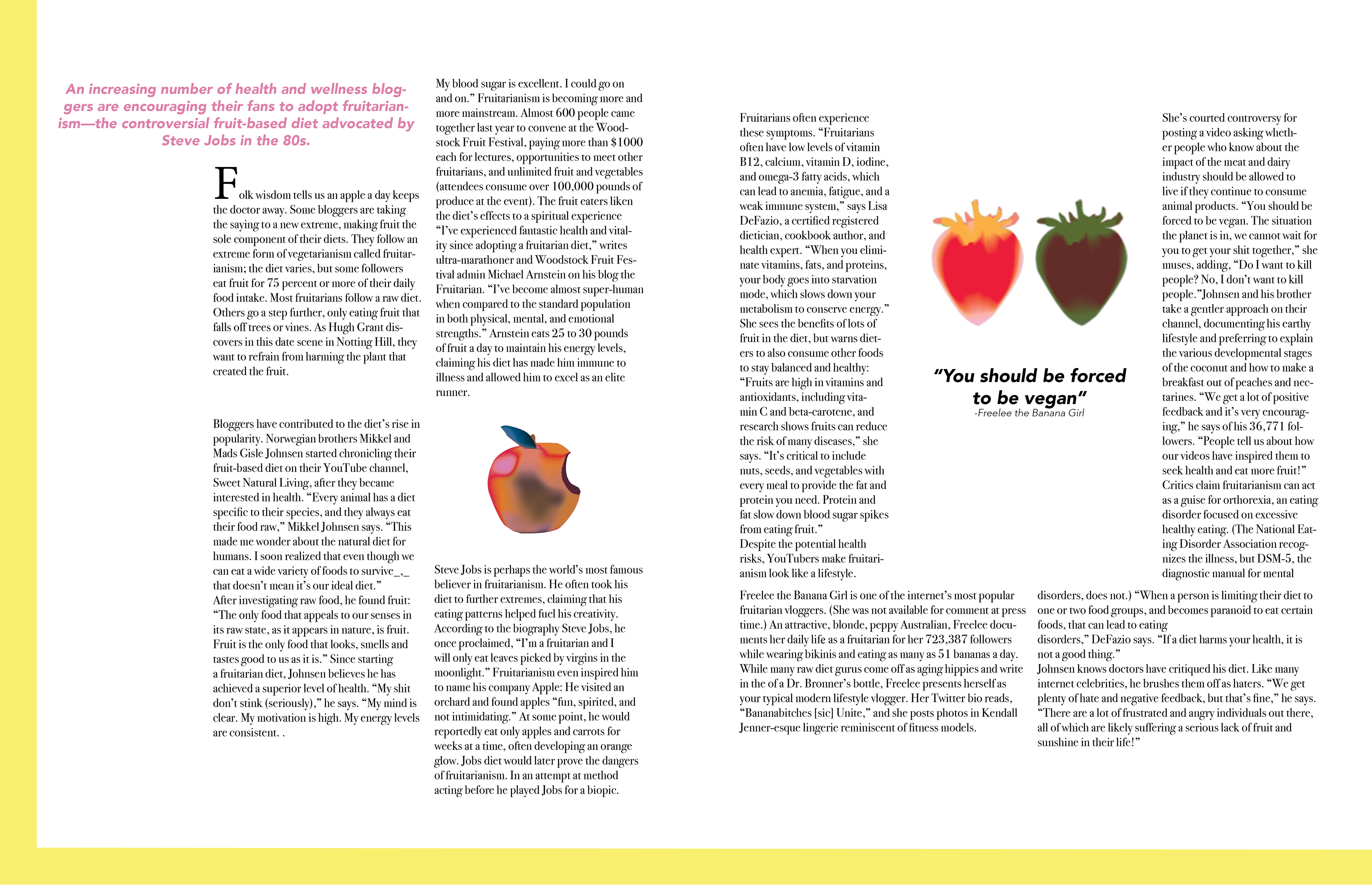
“Inside The Strange World Of Fruitarians” is a magazine spread exercise to practice typography organization and design. The two title pages utilize bright colors to peak the attention of the viewer and the typography design of the title. The two pages that showcase the article use a unique grid system to effectively organize the large body of text with digital illustrations placed purposely throughout the body.